


If you are buying a website that does not include responsive design… Your website is already out-of-date.
81% of Americans own smartphones. (Pew Research Center – Mobile Fact Sheet)
It is imperative that your website responds smoothly on different devices in today’s world. Any web design service that does not include responsive design with their website builds is doing you a disservice. Responsive web design should be standard today.
What is Responsive Web Design?
Responsive web design is exactly what it sounds like: Design that transitions smoothly to different screen sizes and will function well and look great no matter what device is used to interact with it.
Note: In this blog I will be speaking specifically in terms of WordPress web design.
The implementation of responsive design consists of ensuring your website responds to a wide range of screen sizes, such as smartphones, tablets, laptops, and desktops. On all of these devices your website should maintain functionality so the site’s content is clearly displayed with no inconvenience for its viewers from formatting issues. If your website is not currently mobile responsive, you may be neglecting over 50% of your site visitors and potential customers. A non-optimized website is also going to struggle in search rankings on sites such as Google since they place a high importance on a websites responsiveness.

Is my Website Responsive?
If you are unsure your website is responsive and mobile optimized, there are a few easy ways to check:
- The first and easiest way is just simply to view your site on a mobile device. Does the content appear formatted correctly? Is it easy to navigate? Is the content easy to read? If not, your website needs some optimization.
But what about other mobile devices and sizes? How do I check if my website is responsive without having those devices? Easy!
- In the Google Chrome browser:
- Go to your website
- Right-click anywhere on your page and select “Inspect”.
- Or just press Ctrl + Shift + I
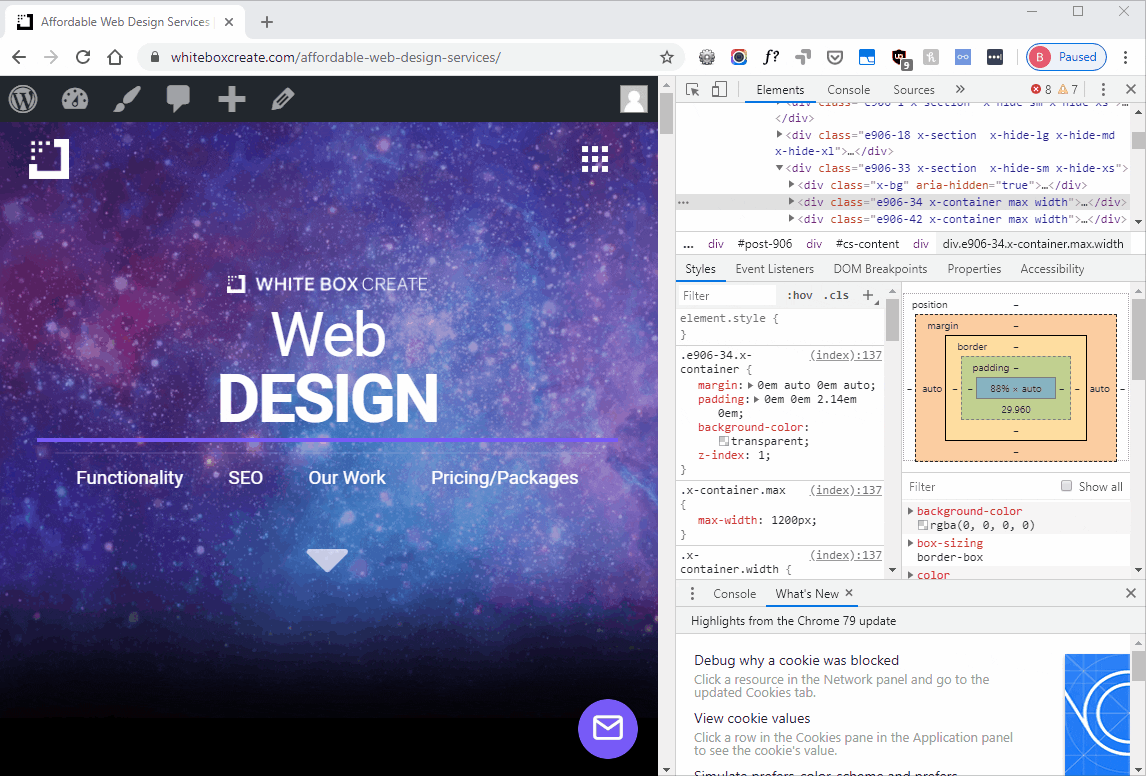
- Now, look at the top of the toolbar that just opened and select the mobile icon. (See below 1.1)
- You can change device sizes at the top bar to see how your site functions on each mobile device. (See below 1.2)
1.1

1.2
One last way to check if your website is responsive and mobile-friendly is by using Googles Mobile-Friendly Test.
If you would like a free site evaluation to make sure your site is completely mobile optimized, you can also enter your info below.
Request a FREE Mobile Site Report Below!
More than just enabling responsive WordPress Design.
52% of users said that a bad mobile experience made them less likely to engage with a company. (Think with Google)
Responsive web design is more than just making sure your web page shrinks to the size of the device’s screen size. You still need to think of the user experience. Sometimes content simply doesn’t transition well when resized or rearranged. You need to make sure you design a UI/UX for that specific device or size that creates a welcoming interface and is not just your original desktop content mushed together to fit.
75% of consumers admit to making judgments on a company’s credibility based on the company’s website design. (Kinesis)
Some web companies may begin to slack when it comes to in putting in the extra effort required for content to transition perfectly throughout the entire. Text and graphics should still be legible and content should look professionally designed and aesthetically pleasing.
A few common issues we come across are:
- Titles still running off the screen
- Bullet point icons look awkward when aligned with the text
- The header looks crushed together
- Footer looks crushed together
- Images don’t transition well
We typically address these issues by creating entirely new content blocks that are only displayed when triggered by the particular screen size that they were designed for. Essentially, we have two versions of the website content. When a mobile screen is detected, the desktop content blocks will be hidden and the mobile content blocks will be displayed. This results in a smooth transition and makes for a simple way to address any issues.
First impressions are 94% design-related. (ResearchGate)
Background Videos and Responsive WordPress Web Design.
Background videos are a popular choice for many people to add some pop to the home page. However, this can become an issue when it comes to responsive design. Many mobile devices will disable the video automatically, leaving an empty hole where it used to be. Mobile providers do this to prevent unwanted mobile data usage for their clients, and to prevent slow load times which can create unhappy visitors.
It is important to have a backup for your videos in case they don’t display on mobile. Setting an image as the alternate background for the video is generally a good idea so that you don’t end up with empty space on mobile devices.
Navigation Menu and Responsive WordPress Web Design.
61% of users said that if they didn’t find what they were looking for right away on a mobile site, they’d quickly move on to another site. (Think with Google)
Navigation is arguably the most important part of any website. It is the main tool visitors use to find the information they are looking for. Visitors are not going to hunt very long on your website for a product or service no matter how good it may be.
Therefore, it is important to spend a lot of time perfecting the user interface. Make sure that visitors will be able to find exactly what they are looking for from any place in the site. Whether they are on your homepage or click the menu, they should be able to easily spot the product or service they need.
Some of our clients have a wide variety of product/services they want to offer. It is often much easier to layout and display that content on a desktop website than it is on mobile. Most of the time creating a separate header or menu style is the only option to give users an intuitive experience. Again, this takes time, and some web design companies may just send you off with the desktop version of the responsive menu, which may be frustrating for users on a mobile device. Be sure to check your mobile and desktop menu to see if it transitions well before accepting a final site design.
Images, Icons, and Responsive WordPress Web Design.
48% said that if a site didn’t work well on their smartphones, it made them feel like the company didn’t care about their business. (Think with Google)
Another common issue is that some images and icons do not transition well on a responsive website. You may have a desktop website with the content staggered; an image on the left/content on right and content on left/ image on right etc. Depending on the image size and purpose, these can look out of place when transitioned to mobile.
As mentioned before sometimes the best solution is to simply rebuild that section for mobile, which will allow you to either reposition the image or sometimes remove the image entirely depending on its significance to the content. Images are great for developing aesthetically pleasing websites but if they are not formatted properly, they can detract from the cohesiveness of the site.
Icons may have the same issue. If you designed a section using icons paired with text blocks (a common design technique), the automatic responsive design may just split the screen space evenly between the text and icons. While the text may still be readable, it will look smushed on one side of the screen on mobile and will be annoying for users to read leading to a higher bounce-rate.
Be sure to check your website for these issues and address them since they may be causing visitors to backout of your site after getting frustrated with your sites format. It also takes away from your company’s professionalism and may create assumptions about your organization.
Your Mobile Website is Now Your Main Website in 2020.
From 2013 to 2018 mobile web traffic increased 222% and now over 50% of all web traffic is done on a mobile device. (BroadbandSearch)
As you can see, responsive web design is more important than ever with mobile usage accounting for over 50% of all web traffic in 2018. It is imperative that your mobile website is just as clean and functional as your desktop version or you could be losing leads due to having a frustrating mobile presence.
If you would like to see if your website is responsive and mobile optimized, you can do so by enter your info below!
Request a FREE Mobile Site Report Below!